


Just keep swimming
Personal app designed and developed to keep track of swim progress, with more than one user, adding new session data on-the-fly, and giving useful information to compare sessions with.
I am constantly trying to streamline my life. Wherever I have the opportunity to create something that makes any aspect of the daily grind easier, or more efficient, or produc more value, I grab it with two obsessive hands. This is how the swim app was born (amongst a few others). I was new to swimming, and wanted to track my progress as a means of staying engaged, and pushing myself to be better.
My vision was for a simple, one-screen web app, where I could enter my laps and times after a session, or view a graph of previous sessions, while sitting and drinking a well-deserved post session G&T.
Key software and tools used


The overview graph
This view is a top-level visual representation of my progress as a swimmer, represented as a graph, ideally showing a neat upward trend as I pushed myself to swim faster, and further. The two values shown are number of laps in bold, and total session minutes underneath.
While a meters per minute graph would be more useable, especially since I routinely used about 3 different pools of differing lengths, depending on where I found myself on gym day, I had a personal preference to see lap numbers and actual times. So, I decided to have these in writing, but make the actual height of each graph bar correspond to the meters per minute number. This means I have an accurate visual representation of my progress, alongside actual data.
Drill down
In order to keep the app simple, but useful, I decided to have three levels of information. The first layer is the overall graph for comparison at a glance. The second is accessed at the tap of a column, to see the date and club. The third level is accessed by the ‘more’ link from the second level, and shows all info available related to the selected column.


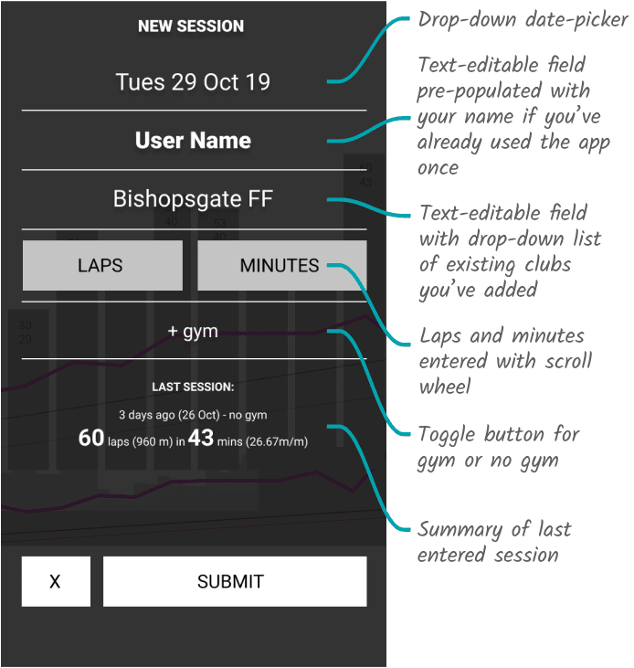
Data entering interface
For the active screen I wanted quick-enter functionality that included relevant input fields such as:
The date - so I could track progress over time, and spot where a few days off made a difference to endurance, etc.
The club - which pool I did the laps in (which would have the length of the pool already stored). I later added the functionality of adding a new club on the fly
Laps and time - the most important info, which would automatically return meters per minute for immediate comparison, based on the pool length
Gym session - this was added as a yes/no option because I found that swimming after a gym session obviously affected my performance in the pool, so it was a good way to explain a drop in meters per minute.
Lastly, I added a short recap of the previous session on that same screen, for ease of comparison. So, in all, I’d have one screen that tells me everything I need to know about how effective my session was.


Resulting success
I built this web app, and refined the design after testing it on a number of sessions. Since its final build iteration, I have used it religously, and derived great benefit from the resulting comparitive information it has logged. I take great pride in the fact that only very minor amends have had to be made between the UX design of this app and its final online version, and it has since been used by other people to achieve the same outcomes.
